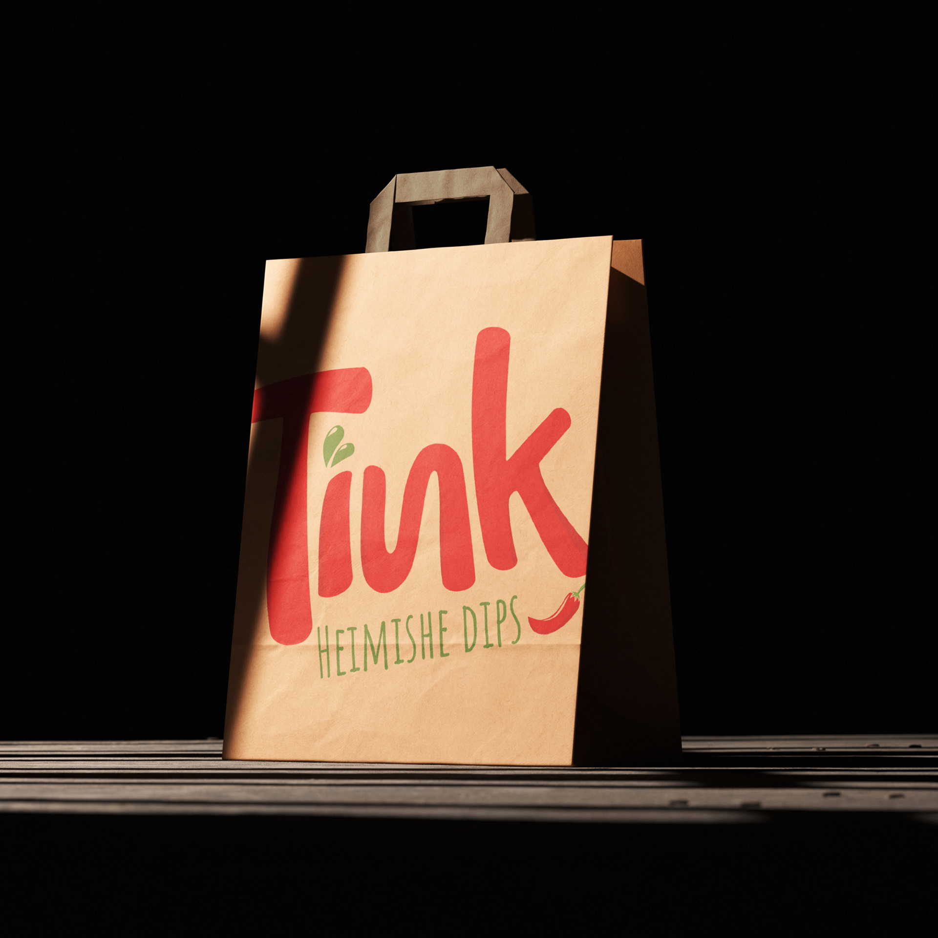
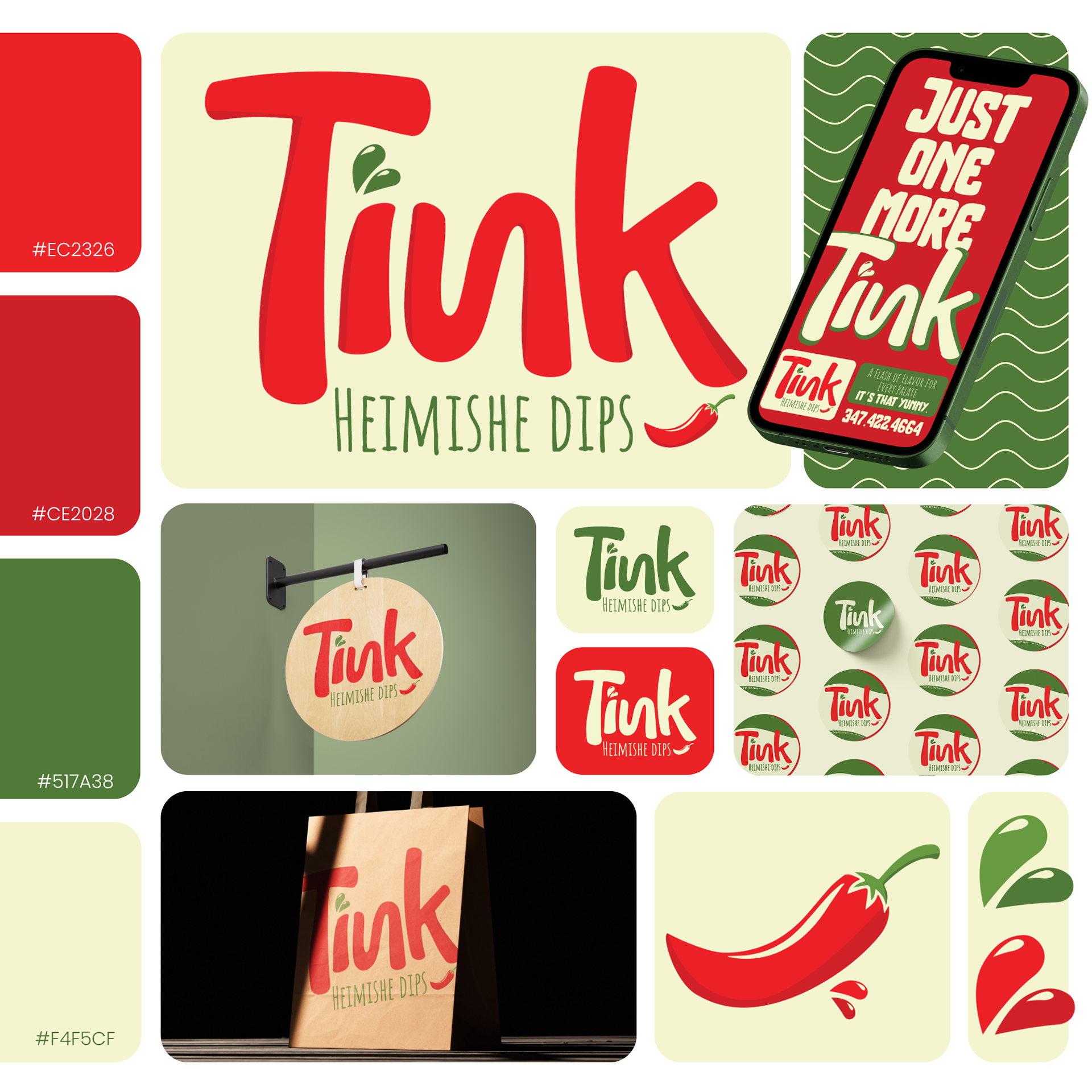
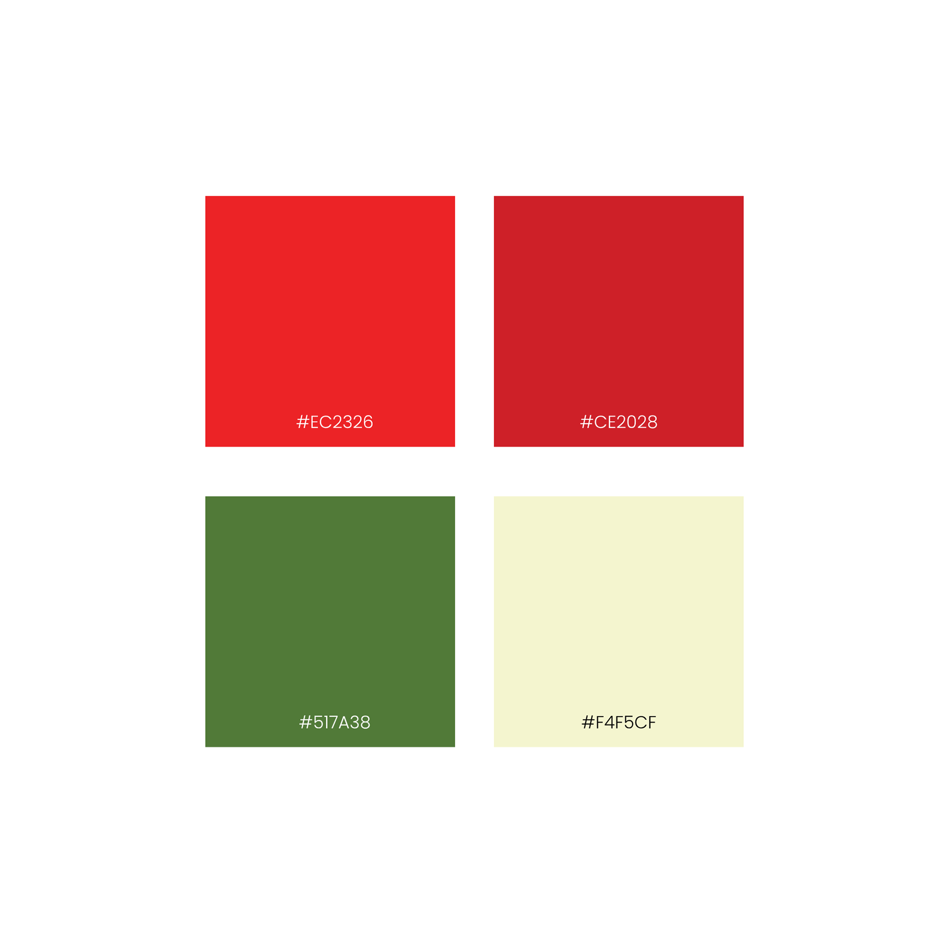

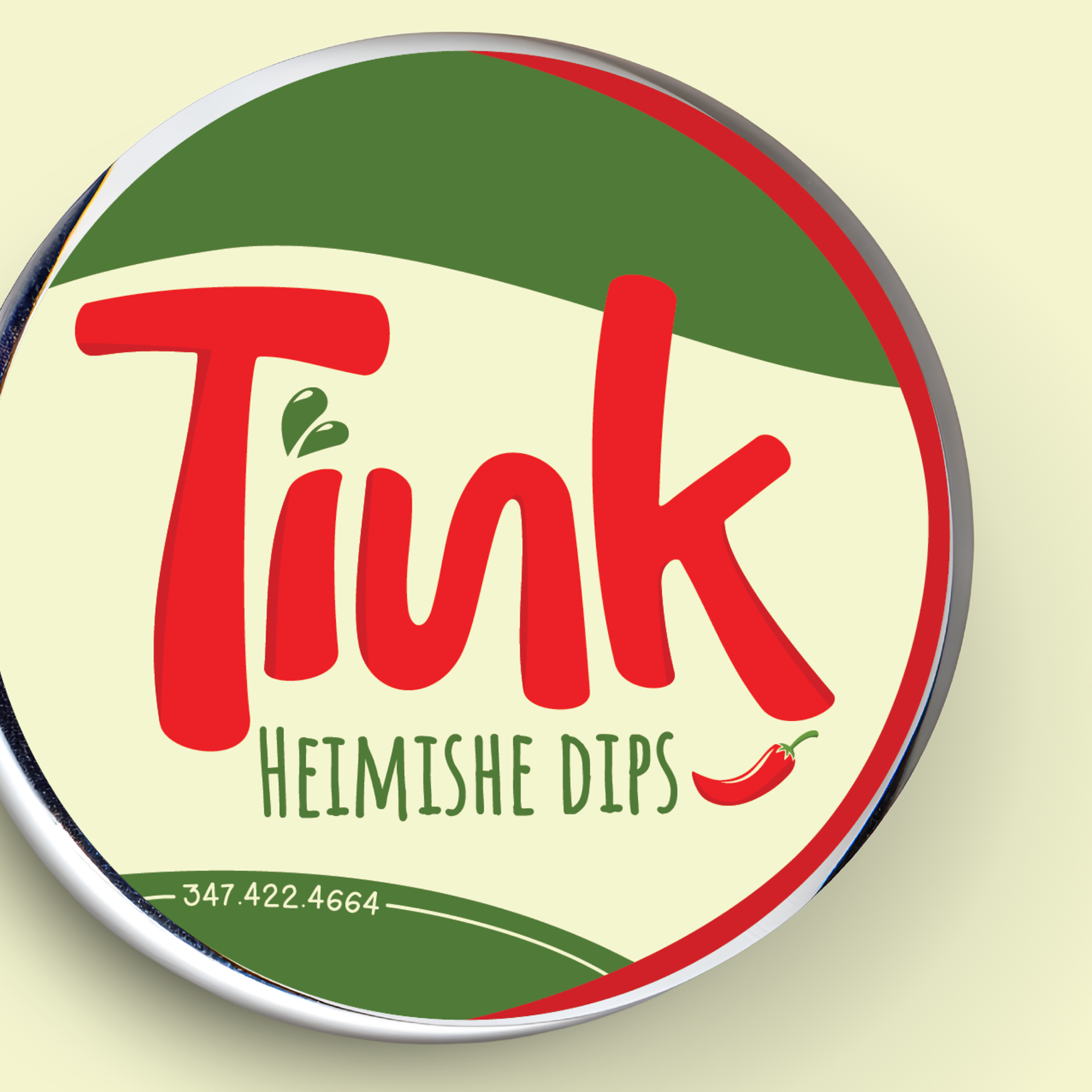
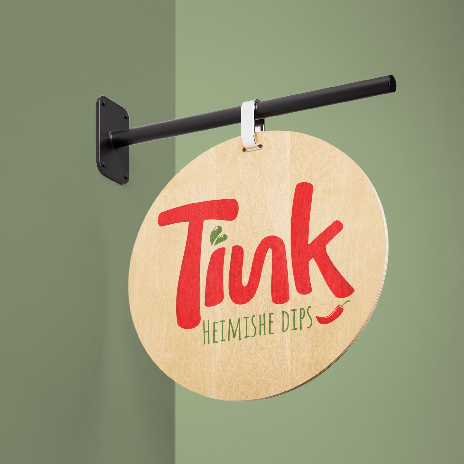
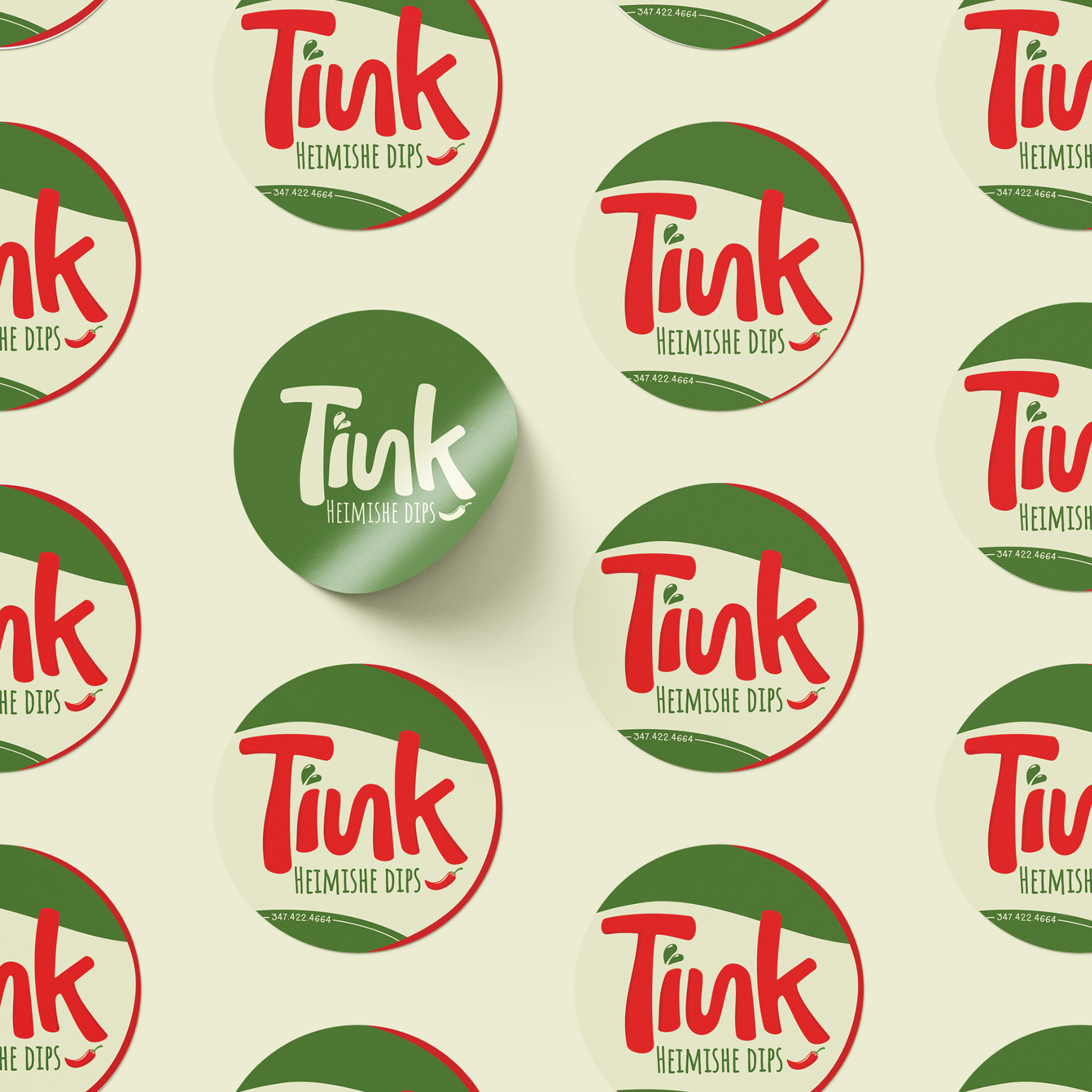
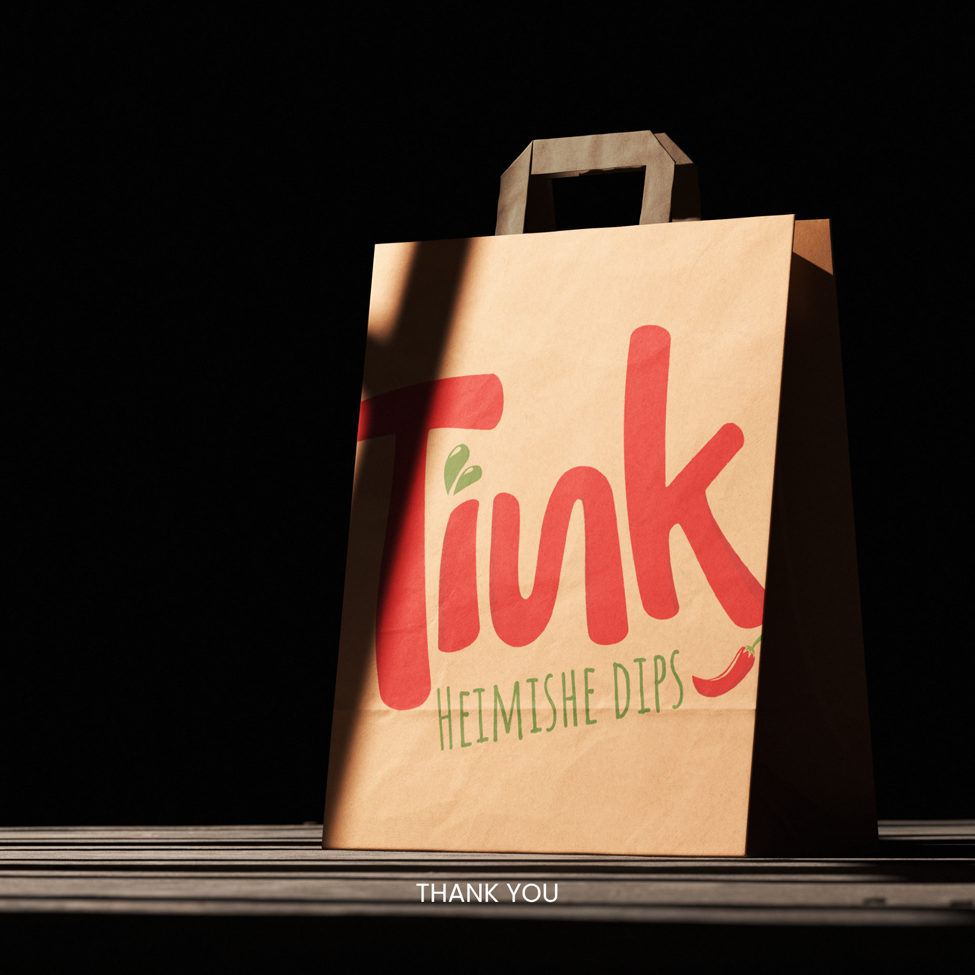

Tink branding project was created to bring a bold and flavorful personality to a modern food brand. Inspired by the warmth and richness of homemade dips, the identity uses vibrant reds, earthy greens, and soft cream tones to reflect freshness, spice, and comfort. The playful typography and illustrated pepper elements add energy and character, giving Tink a fun, memorable presence across packaging, signage, and digital applications.